Monday, June 7, 2010

ap art final


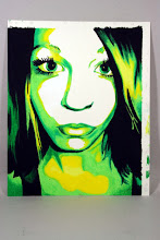
This was my favorite piece I created all year, because I feel like it really represents my style. I have always been interested in the graphic aspect of art, but this year I also learned to create more layering and depth in my work.
My advice that I would give to future AP 2-D students is to not procrastinate, because most of the time you have to create two or three pieces of art in a month, which is not really that long and it goes by fast. You don't want to be stuck two days before the critique deadline with one or no pieces completed!
For myself, I learned that I do get stuck in one style, but if I push myself I can challenge myself to create art with new mediums or art that is out of my comfort zone, or art that is not so "safe." I also learned that I can work really well with deadlines even if sometimes it feels rushed.
I have a few favorite activities this year and the first was bookmaking. I thought this was a very useful skill because bookmaking is not really a form of 2-d art, but it is important to experiment with different areas of art, and it was also a really fun project. I also liked the Jesse Reno workshop because it taught me to not be so tight and graphic with my art, and be more creative and broad. I think every activity taught me something this year.
In 10 years i will hopefully be working for a graphic design company, or possibly starting my own company!

Monday, April 19, 2010

final pieces


i am finally going to put my little wooden person to good use and use it for one of my pieces. i plan on using graphite and drawing it at an unexpected angle, and use that piece as "perspective." i also am using one of my life drawings for a piece, although i am not sure which principle/element of art it will fit under. im thinking either unity or harmony, because i purposely used a common color theme throughout the piece. and then lastly i am doing another piece with the cute little bathroom-ish icon people for either dominance or emphasis. :)

Monday, April 12, 2010

more photorealistic drawings

i loved the photorealistic drawings ms mcbride put up on her blog so i decided to explore the internet for more. this is what i found:


cath riley


linda huber


w.j. gibson


Tuesday, March 16, 2010

marchhh.

pieces for this month: texture & pattern/repetition


this image i want to use for my texture piece. ive already started the background, but i know i want to go more in-depth with it after i add in the people, which will be the main textured part of the piece.
i also want to do something with pattern or repetition, also using silhouettes of people. the only thing i am worried about is that this image will come out too flat and too alike my old style, with no depth.

Monday, March 8, 2010

idea

from my critique i got alot of insight into what i need to do to improve my works and stray away from my safe style. i was looking at artists over the weekend and i came across a guy named jeff schaller. his paintings incorporate alot of texture, which i like, and his brush strokes are more loose and spontaneous. i definitely want to do a piece that incorporates these elements of his style.


Tuesday, March 2, 2010

concentration #3

i dont have pictures yet :/

overall, im pretty happy with my concentration. the last two pieces i did were value and contrast.im really happy with my value piece (the graphite drawing of one of my friends), but i definitely think i need to add more to my contrast piece (the piece with the black and white background and the blue and yellow silhouettes of the children.) i'm thinking of adding on more layers to that piece to give it more depth.

7 pieces down, 5 to go.