

my concentration is portraying the human figure through the use of the elements and principles of art (each piece represents a different element/principle)
i chose this concentration because i thought it would be a good challenge for me, and it would push me to think of new concepts and use different mediums
1.movement. for this piece i drew the figure using graphite, colored pencil, and black paper. instead of simply using the same medium for the background, i cut the figure out and pasted it onto a wash with watercolor. these two pieces are similar in the sense that i used a variety of mediums and layering of the paper. it kept me interested because it was a new take on my style.
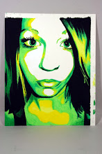
2.shape. its hard to tell from the photograph, but the piece on the right i made from different colors and shapes of cut-out paper. while i was cutting out the black pieces, i decided i really liked how the black paper looked with the shapes cut out and the negative space it created, so i decided to incorporate that into my finished piece. this piece was challenging for me because i'm used to painting and drawing, but this time i had to create a somewhat abstract representation of a person using paper. because of this, i had to use different colors and layers of paper to create depth.
7 comments:
I like the symmetry in the piece you are using for balance (yes?). I like how it is symmetrical and there is the same object weight on either side, but they aren't the same image. As always, you have a great color pallet for all of your concentration pieces. I'm concerned that there isn't enough depth in your pieces, though. The foreground is really good, but I feel like the background and the middle ground need to be developed more. I also feel like your concentration this year is really similar to the one you had last year, but instead of faces you chose to do bodies. When you start doing your next pieces I would try loosen up a bit. Hope that this was helpful. Good work :)
ha wow, your concentration is really an awesome idea. i like how your movement piece actually has the feel of a person in action. although you did the figure in graphite and the background in blue there is still unity between the generally stark colors. but I also feel like although the two work well there is still something lacking. possibly by layering the background with other items, or by giving an identifiable texture that would make it work even better. the figure also appears to be slightly flat, i think the values in the pants and arms need to be pushed a bit more, also the lack of face is sort of disturbing, but i don't know if that is what you intended or not
i really like your work alot. its super fun. and i like your concentration idea! I love your top piece and it deffinitely shows movement. I think that some more value in the pants would be good because the body and arms have so much detail and value it would work better if the pants did as well. I like how you are cutting out the paper, it has a cool texture and is a good way to layer things with a sharp edge which is what alot of your work has. I like the sharp crisp look of your work. It is really nice and i like it alot :)
The composition in your work is impressive. Use of balance and color in both pieces is super effective (like an attack on pokemon). The composition and line quality of your work is satisfying and interesting, however it seems as if parts of the work are too constrained (almost like a photo manipulation instead of a drawing). This tightness certainly makes style in the pieces though. My main critique of this work (mainly the motion piece) is relating to some flaws in basic anatomy, i suggest looking over an anatomy book (there is a great one in the art room) and focusing on proportion of men's hip to shoulder ratio. In all, your work is very stylish and compositional-ly fantastic, keep it up!
Hey i love your idea with the concentration, it make sit so you can draw what you want and keep that Monica style while still pushing yourself and changing stuff up. Ok so i agree with lindsay i think you can develop the background more (especially for the movement one) and make them more connected to the figure. also i feel like you can push the element on the viewer even more to help us understand what you are portraying. I love you color choice and how you have a consistency with the black paper and the types of lines and shading you use. great job ! :)
First of all I would just like to say how much I enjoy your work! It is very precise and eye catching. I saw some of your art from last year and it was really good, but I see that you have progressed a lot this year as well, which is great! I think your concentration idea is a really good choice and I am excited to see it all finished!
So for the first piece, movement, I am gonna hafta say that you did a great job demonstrating this principle. I can see the movement through the body of the skateboarder. Proportionally your piece is very well done. I’m not sure there is a sense of unity through the emphasized skateboarder demonstrating movement and the light wqash in the background. Maybe if you find a way to tie the two together? I am not sure how you would do that though. so I am of no help! The value within this piece is well done. The muscles that are defined through shading is very impressive, you have a talent here, because mostly I just see you doing graphics, but your detailed work is great as well. I really like this piece.
So for the second piece, shape, I love it! This is definitely one of your very strong works! The demonstration of space is great, and I really think that you demonstrated the shape through the small pieces of paper. Also, I think that you branching out past painting and drawing is great! There is a sense of harmony and unity through this piece from the opposites of each individual.
Keep up the good work, I am loving it
Your choices of color are what stand out to me the most. But you seem to be a bit restricted along the lines of movement. It seems static and forced. Which isn't a bad thing for now, but in the future, you may want to experiment a little more and pull yourself outside your own comfort zones in order to portray movement in a different manner. This way, your works will progressively show how you've 'losened up' a bit in order to create variation in style. Overall, though, I love where you're going with this concentration. Great work!
Post a Comment